What is Skeuomorphism and how it's developed?
This blog post is the first in a 4 part blog series in which I will cover design trends from the 80's Skeuomorphism to today's re-emerging Y2K designs. It's always interesting to see how and why some trends stay or don't. And perhaps why some trends drip on through all eras. We'll also look at some truly inspirational work which will hopefully inspire.
What is Skeuomorphism? It’s a term used in UI when objects mimic their real-life counterparts in how they appear or how they can be interacted with, for example, using a floppy disk icon to represent ‘save’. Or a screwed-up piece of paper going into a bin to define ‘delete’. The idea was to make icons familiar to users by creating them to look how we already knew them.
Skeuomorphism was popularised back in the 80s by Steve Jobs. An excellent early example is a calculator on the Macintosh desktop with the buttons having large contrasting drop shadows, so the user instantly knows how to interact with it. Skeuomorphism later found its place in 2000 on the early IOS devices. It was a way of getting the user more familiar with interacting with mobile devices.
Early example of the calculator on the Macintosh desktopEarly IOS device
We very quickly moved on from Skeuomorphism into a flat design. Whilst Skeuomorphism helped users navigate the new digital world better, it was also a drawback for designers. It made designs look cluttered. With a generation growing up not knowing a world without digital interfaces, was there much need for this trend anymore?
Flat design became popular. Gone were bevelled edges, drop shadows and gradients and flat icons in their place. Windows 8 is an excellent example of this.
Windows 8
IOS 7 was apples first jump into a flat design. Many people quickly declared Skeuomorphism dead, but it wasn’t entirely true as we can still see its uses, such as the camera icon or videos. So even though it has moved forward, saying it died was a little far-fetched.
IOS 7
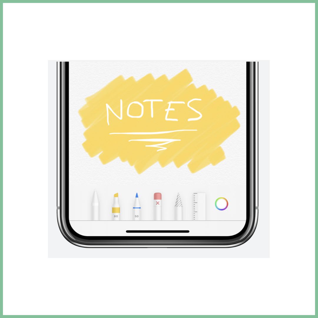
Although we have moved on from the early days of Skeuomorphism, it’s undoubtedly something we continue to use in a much more subtle way. Skeuomorphism and Flat Design do not need to be exclusive to each other, and we can use the more common flat approach but still apply skeuomorphic attributes. A great example of this would be the IOS 15 notes app, which uses very Skeuomorphic pen attributes. A more familiar design would probably be the weather app, which includes many Skeuomorphic elements.
IOS 15 notesWeather App
We certainly don't use Skeuomorphism as much as we used to, as we all become more familiar with using digital devices. However, with the rapid evolution of the digital world and new products released, it's likely to be used to help users feel familiar with new ways of using devices. For example, with the introduction of driverless cars, smart watches (made to look more analogue) and certainly in AR and VR as we attempt to help users navigate these new concepts. And it's fair to say that Skeuomorphism has undoubtedly inspired some of the effects we see in the latest trends, like Neumorphism with the use of inner and drop shadows which later inspired Claymorphism, a movement I will touch on at a later date.
In this 3 part blog post, I will cover some designers that have inspired me or currently do so in my career. We’ll start with Jessica Walsh, whom I discovered early on in my career and who has continued to inspire me.
In the second part of this 3 part series, I will be looking at Dann Petty who is an inspirational web designer. Last time I covered Jessica Walsh so be sure to go back and check that out.
In the final part of this 3 part series, I will be looking at Aaron Draplin. This is probably the designer I have been following the longest and who has shaped how I design.